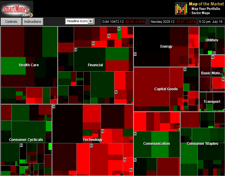
Map of the Market, from SmartMoney.com, maps the stock performance of 500 US corporation. Individual companies are represented by different plots of land sized according to their market capitalisation. The colour of the plot indicates recent changes in stock price. It was developed by Martin Wattenberg.
[For more information see the Map of Month article, "Show Me The Money: The Map of the Market" in Mappa.Mundi Magazine, August 2001.]
http://mappa.mundi.net/maps/maps_023/image1.html